

📝 Disclaimer: The content on this site is for informational and design inspiration purposes only and does not constitute professional architectural, engineering, or construction advice. Always consult with a certified contractor or professional before starting any major home renovation, electrical, or DIY projects.
* This post may contain affiliate links. As an Amazon Associate, we earn from qualifying purchases at no extra cost to you.
* This site uses AI technology for content assistance and illustrative imagery. Images are for demonstration purposes and do not depict real people or events.
Surface Character and Visual Identity
A kitchen cooktop surface can read as a quiet part of the work area or as a defined visual feature within the cabinetry. Its appearance is shaped by sheen, color, edge treatment, and surrounding materials, including nearby counters, backsplashes, cabinet fronts, and hardware.
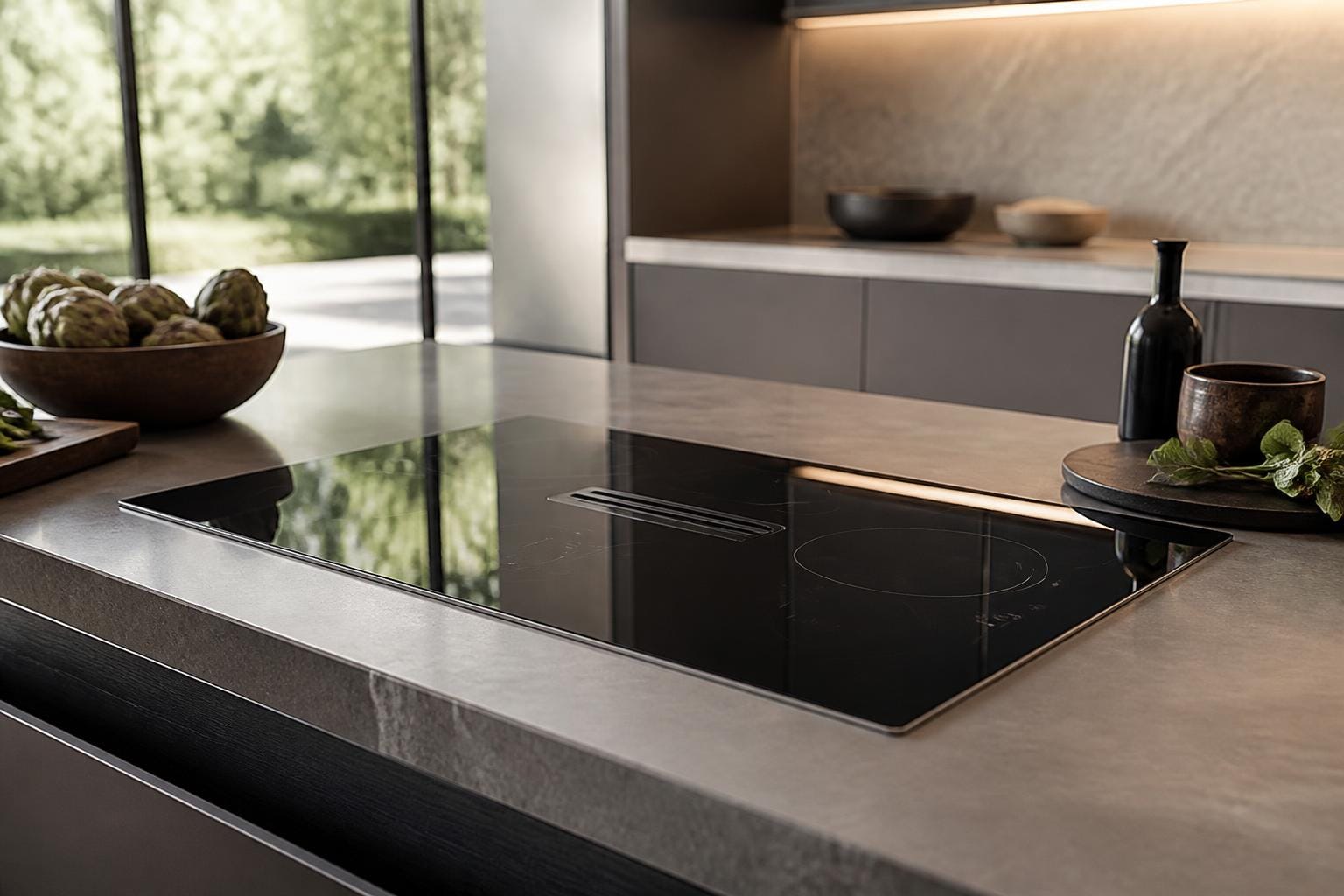
Dark surfaces often create a concentrated, graphic impression, especially when set against pale cabinetry. Lighter surfaces can appear more continuous with the surrounding counter area. Reflective finishes introduce small highlights from windows and fixtures, while matte treatments tend to present a softer, more visually muted field.
Glass-ceramic cooktop surfaces often have a smooth, continuous appearance, with subtle cooking-zone markings visible against the glass. Stainless-steel surfaces introduce a metallic sheen and more defined appliance details, while enamel-coated metal surfaces typically present a solid, opaque finish. These material differences influence how the cooktop relates visually to surrounding countertops, cabinetry, and kitchen lighting.
Relationship With Cabinetry and Counters
The cooktop area contributes to the overall rhythm of a kitchen wall or island. When its surface tone relates closely to the countertop, the appliance zone may appear visually integrated. A stronger contrast can define the cooking area as a distinct focal point without requiring decorative emphasis.
Material continuity also affects how unified the composition feels. A dark cooktop paired with dark cabinet hardware can create repeated accents across the room. A neutral surface beside wood cabinetry may support a warmer, more layered impression, while a metallic edge can introduce a cooler note among stone, tile, or painted finishes.
The surrounding counter remains part of the visual frame. Broad, uninterrupted surfaces can make the cooktop appear embedded in the worktop composition, whereas contrasting borders or changes in texture can give it a more outlined presence.
Light, Reflection, and Atmosphere
Natural and artificial light change the way a cooktop surface is perceived throughout the day. Glossy finishes may catch bright reflections from windows or pendant lights, producing shifting highlights. Matte surfaces usually show less visual sparkle and can contribute to a calmer, denser appearance.
The surface can also influence the mood of nearby materials. In a kitchen with pale cabinets and reflective backsplash tiles, a dark cooktop may provide visual grounding. In a deeper-toned kitchen, a lighter appliance surface can interrupt the darker palette and create a small point of contrast.
The surrounding lighting mood matters more than the surface alone. Warm illumination can soften charcoal, bronze, or black tones, while cooler light may emphasize gray, silver, or crisp white details.
Spatial Context in the Kitchen
On an island, the cooktop may become part of the room’s central visual field, sharing attention with seating, decorative objects, or pendant lighting. Its appearance can therefore affect how the island reads as a single surface or as a combination of cooking and social zones.
Along a wall run, the cooktop often participates in a more linear composition with cabinets, backsplash patterns, and vertical appliance forms. Repeated horizontal lines can make the area feel calm and continuous, while contrasting shapes create a more articulated arrangement.
The visible relationship between the cooktop and nearby storage also influences the impression of order. Streamlined cabinet fronts can make the appliance area look restrained, while open shelving or varied display surfaces can create a more collected kitchen character.
Visual Observations for Cooktop Surface Styling
- Surface sheen: Gloss introduces highlights and reflection, while matte finishes offer a quieter visual presence.
- Color contrast: Strong differences between the cooktop, counter, and cabinets can define the appliance zone.
- Material pairing: Wood, stone, tile, painted cabinetry, and metal accents each alter the perceived character of the surface.
- Island presence: A cooktop on an island participates in the room’s central composition and may share attention with seating or lighting.
- Wall-line continuity: A cooktop along a cabinet run can reinforce horizontal rhythm across the kitchen.
- Lighting mood: Daylight and fixture illumination can shift the apparent depth, warmth, and reflectivity of the finish.
- Visual framing: Counter borders, backsplash patterns, and cabinet lines can make the surface feel either integrated or clearly outlined.
Overall Kitchen Impression
The appearance of a cooktop surface is one small element within a larger network of finishes and visual lines. Its influence comes from how it relates to the countertop, cabinetry, backsplash, hardware, and available light rather than from its isolated form.
A subdued surface can support a quiet, continuous kitchen composition. A contrasting or reflective finish may give the cooking zone stronger definition. These differences allow the same type of appliance area to appear minimal, layered, warm, industrial, or contemporary depending on the surrounding material language.